Beyond Basic Black: Color Confidence for Your 2026 Wardrobe
Ads
The fashion landscape in 2026 is making more room for saturated color, expressive combinations, and vivid accessories alongside enduring neutrals.
This guide offers three practical ways to introduce color without treating seasonal trends or traditional color-analysis rules as mandatory.
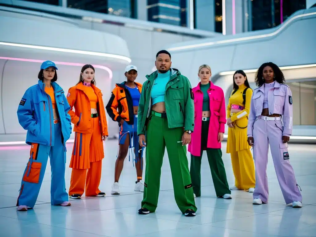
Beyond Basic Black reflects a broader move toward more expressive dressing, with current runway and street-style coverage showing stronger use of red, blue, purple, yellow, turquoise, peach, and other saturated shades.
Ads
That does not mean black, beige, brown, navy, or other neutrals are disappearing; instead, current styling often combines familiar foundations with stronger color accents or deliberately bold monochromatic looks.
The most useful approach is to treat color as a personal styling tool rather than a set of rigid rules, allowing trends to inspire experimentation while keeping comfort, versatility, and personal style at the center.
Understanding the 2026 Color Landscape
Ads
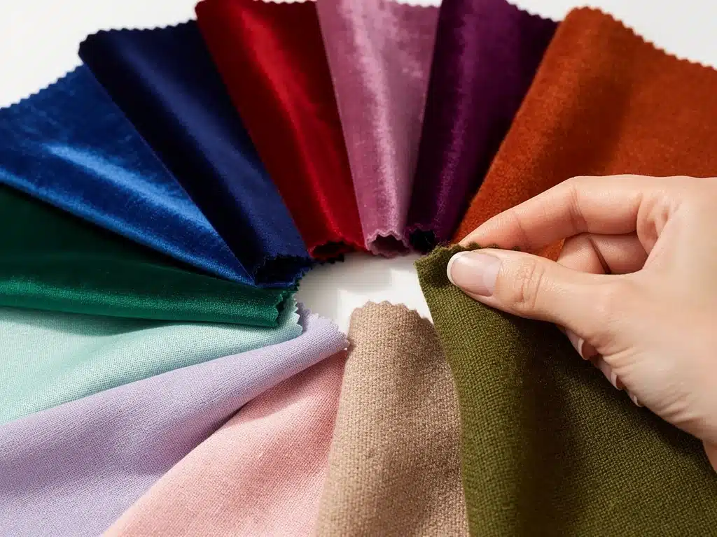
Fashion coverage for fall 2026 highlights a broad palette rather than one dominant shade, with electric blue, vibrant red, royal purple, butter yellow, burgundy, turquoise, and peach appearing across major collections.
At the same time, earthy shades, brown, navy, charcoal, oatmeal, and other neutrals remain highly visible, showing that the year is not defined by a complete rejection of understated dressing.
The practical takeaway is that color in 2026 is flexible: it can appear through a single accessory, a tonal outfit, a bright knit, or a full head-to-toe statement.
Tip 1: Start with Strategic Color Accents
If most of your wardrobe is black, gray, navy, or beige, adding one colorful element can be an easier starting point than rebuilding the entire wardrobe.
A handbag, pair of shoes, scarf, knit, shirt, or piece of jewelry can introduce a new shade while allowing familiar neutral pieces to remain the foundation.
This approach also makes it easier to test whether a color works with the clothes you already own before investing in larger or more expensive pieces.
Using Accessories as Color Anchors
Accessories can create a strong visual focal point because they introduce color without requiring the entire outfit to revolve around it.
A red bag, cobalt shoe, yellow scarf, or turquoise earring can make a neutral combination feel more deliberate without demanding a dramatic styling change.
The specific shade matters less than whether the piece coordinates with the rest of your wardrobe and feels natural enough that you will actually wear it.
- Handbags: Use a saturated bag as the focal point of an otherwise neutral look.
- Footwear: Colored shoes can introduce contrast without changing the main clothing palette.
- Scarves: Printed scarves can connect several colors within one outfit.
- Jewelry: Colored stones, enamel, resin, or metal finishes can provide smaller accents.
Layering Color Gradually
Layering gives you control over how much color is visible, making it useful when experimenting with shades that initially feel unfamiliar.
A bright shirt under a neutral jacket, a colored knit beneath a coat, or visible socks under trousers can introduce color in smaller proportions.
As confidence grows, the same shades can be moved into larger pieces such as trousers, dresses, outerwear, or coordinated sets.
Tip 2: Use Color Theory as a Tool, Not a Rule
Basic color theory can help explain why some combinations produce strong contrast while others feel more tonal or harmonious.
Complementary, analogous, and monochromatic schemes are useful starting frameworks, but clothing does not need to follow the color wheel perfectly to look intentional.
Fabric texture, saturation, proportion, lighting, personal preference, and the rest of the outfit can matter just as much as the theoretical relationship between two hues.
Skin Undertones Are Optional Styling Guidance
Personal color analysis often groups people into warm, cool, or neutral undertones and recommends palettes that are intended to harmonize with those characteristics.
This can be a useful styling exercise for some people, but it should not be treated as a scientific requirement or a restriction on which colors someone is allowed to wear.
The simplest test is still practical experimentation: try the color near your face in natural light and decide whether you like the overall effect.
- Warm palettes: Often include ochre, rust, camel, olive, coral, and warm reds.
- Cool palettes: Often include cobalt, violet, icy pink, berry, and blue-based reds.
- Neutral palettes: Can combine elements from both groups depending on saturation and styling.
Applying Basic Color Relationships
Complementary colors sit opposite one another on a traditional color wheel and can create high visual contrast when worn together.
Analogous colors sit near one another and often produce a softer transition, while monochromatic dressing uses multiple shades or values of one color.
These relationships are best used as inspiration rather than formulas, because successful styling ultimately depends on proportion, material, silhouette, and individual taste.
Tip 3: Experiment with Bold Combinations and Texture
Once individual colors feel familiar, combining two or more stronger shades can create a more expressive outfit without requiring complicated styling.
Fall 2026 runway coverage shows designers using saturated colors both as accents and in larger blocks, reinforcing the idea that bold combinations can coexist with wearable silhouettes.
Texture can make those combinations feel more dimensional by changing how light interacts with each color across wool, denim, leather, satin, knitwear, or suede.
Working with Complementary Hues
Blue and orange, yellow and purple, or red and green are classic complementary pairings, but they do not need to be used at equal intensity.
One color can dominate while the second appears only through a bag, shoe, knit, belt, or other small element.
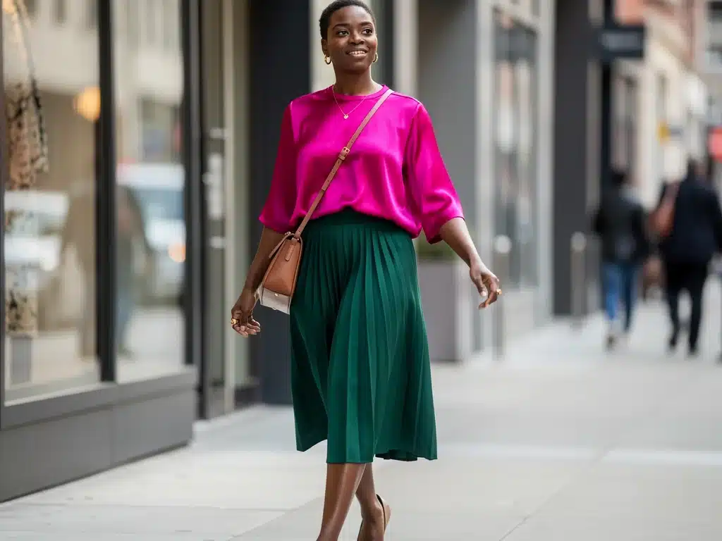
Adjusting saturation is another way to make the combination easier to wear, such as pairing burgundy with muted green instead of bright red with vivid green.
- Blue and orange: Can range from cobalt with tangerine to navy with rust.
- Yellow and purple: Can be softened with butter yellow and plum.
- Red and green: Can feel more modern when interpreted as burgundy with olive or cherry with forest green.
Mixing Textures for Depth
Texture changes the visual character of a color, which is why the same shade can look very different in silk, wool, leather, denim, or cotton.
A saturated satin blouse paired with matte wool trousers can create contrast even when the colors are relatively close.
Using texture deliberately can therefore make a colorful outfit feel more layered and considered rather than relying on additional colors for visual interest.
Patterns and Prints in 2026
Prints provide another way to introduce several colors at once without building the combination piece by piece.
Florals, checks, stripes, geometric graphics, and abstract patterns continue to appear across seasonal fashion, but no single print category defines all of 2026.
A practical approach is to choose one shade from the print and repeat it elsewhere in the outfit through a shoe, jacket, knit, or accessory.
Building a Versatile Color Wardrobe
A colorful wardrobe becomes easier to use when new pieces coordinate with multiple items that are already in rotation.
Navy, charcoal, brown, camel, cream, denim, olive, and black can all function as useful foundations alongside brighter colors rather than competing with them.
Before buying something simply because the shade is trending, consider at least two or three realistic outfits you could build around it.
What 2026 Fashion Coverage Is Actually Showing
Current fall 2026 coverage shows both bold and subdued directions, which makes the year more varied than a simple shift from neutrals toward color.
Vogue has highlighted electric blue, red, royal purple, butter yellow, peach, turquoise, and burgundy, while other current looks continue to rely heavily on chocolate brown, charcoal, navy, oatmeal, and earthy shades.
The strongest takeaway is therefore not that black is “out,” but that designers and stylists are giving consumers more permission to combine neutral foundations with expressive color.
Color as an Accent Remains Highly Relevant
Several current styling examples use just one saturated element rather than dressing head to toe in a bright palette.
This might mean a colorful bag with a neutral coat, a bright knit over understated trousers, or a strong shoe with an otherwise quiet outfit.
That makes the accent-first approach particularly useful for people who want to participate in current color trends without abandoning an existing neutral wardrobe.
Be Careful with the Psychology of Color
Colors can carry cultural associations and personal meanings, but statements such as “blue communicates trust” or “red communicates power” should not be treated as universal psychological laws.
How a color is interpreted can depend on culture, context, shade, styling, personal experience, and the other visual cues present in an outfit.
Color can still be used intentionally for mood or self-expression, but personal preference is generally more reliable than assuming a particular hue will create the same response in everyone.
Use Context Instead of Fixed Meanings
A bright red coat at a creative event may read differently from the same shade used in a conservative professional setting.
Similarly, pale blue, navy, electric blue, and turquoise belong to the same broad color family but can create very different visual impressions.
Considering occasion, silhouette, material, and styling provides more useful guidance than assigning one fixed emotional meaning to each color.
Overcoming Hesitation Around Color
People who wear mostly black or neutrals do not need to replace those pieces in order to experiment with stronger shades.
Start with the amount of color that feels comfortable and increase it only when the new combination becomes something you genuinely want to repeat.
There is no styling benefit in forcing a trend that makes you feel less comfortable, because confident dressing depends partly on familiarity and personal preference.
Use Inspiration Without Copying Every Trend
Runway photography, street style, editorials, and social platforms can provide ideas for color proportions and combinations.
Instead of reproducing an entire outfit, isolate the part that works for you, such as a red accessory, a blue-and-brown combination, or a tonal purple look.
This makes trend inspiration easier to translate into an existing wardrobe and reduces the need for unnecessary purchases.
Making a Colorful Wardrobe Last Beyond 2026
A garment does not become unusable simply because its color is no longer highlighted in seasonal trend reports.
Fit, fabric, condition, versatility, and how naturally a piece integrates into your personal wardrobe often matter more for long-term wear than whether the shade remains fashionable.
Buying colors you genuinely enjoy makes it more likely that they will remain useful after the current trend cycle changes.
Balance Trends with Personal Style
Seasonal reports can help identify fresh combinations, but they should be used as a source of ideas rather than a shopping checklist.
A color that already works with your wardrobe may provide more value than a highly promoted shade that coordinates with almost nothing you own.
This is also a practical way to approach personal fashion with less waste and more intentional purchasing.
| Key Tip | How to Use It |
|---|---|
| Start with Accents | Introduce one strong color through accessories, knitwear, or layering before committing to larger pieces. |
| Use Color Theory Flexibly | Use complementary, analogous, and tonal relationships as inspiration rather than strict rules. |
| Experiment Boldly | Combine stronger hues with thoughtful proportions, textures, or neutral anchors. |
| Ignore Rigid Rules | Skin undertone systems and trend forecasts can guide experimentation, but personal preference should remain central. |
Frequently Asked Questions About 2026 Color Trends
Fall 2026 fashion coverage highlights shades including electric blue, vibrant red, royal purple, butter yellow, burgundy, turquoise, and peach, while brown, navy, charcoal, and other neutrals remain important.
Start with one accent such as a bag, shoe, knit, scarf, or shirt and pair it with familiar neutral pieces. This lets you test a color before making it a larger part of your wardrobe.
No. Undertone analysis can be a styling tool if you enjoy it, but it is not a requirement. Trying different colors in natural light is often the simplest way to decide what you like.
Current styling supports both tonal dressing and stronger combinations. Blue with orange, yellow with purple, burgundy with olive, or a bright shade paired with brown, gray, navy, or black are all possible starting points.
Choose colors you genuinely enjoy, favor pieces that work with multiple existing outfits, and prioritize fit, fabric, and versatility instead of buying every seasonal trend.
Looking Ahead
Beyond Basic Black fits the current fashion moment, but the strongest development is increased variety rather than a universal abandonment of neutral dressing.
Current runway and street-style coverage supports richer saturation, unexpected combinations, and expressive accessories while continuing to feature earthy tones and familiar neutral foundations.
The most durable strategy is therefore to use 2026 trends as inspiration, experiment gradually, and build a wardrobe around colors that continue to feel useful and personal beyond the current season.
